I use a lot of raster data, both for cartography and analysis. Recently, I was asked to build a digital elevation model of the entire state of California at 10 meter resolution. This means the entire state is covered in square-shaped cells that are 10 meters on each side, and each cell contains a value for the elevation in its center. That works out to over four million pixels!
The resultant data layer was very, very large, so I asked the client if a coarser resolution would suffice, and I provided some examples. He said they really needed a hillshade of topography at 10 meters, and I found a way to make it work. After the data were delivered, I realized it made for a very nice illustration of how resolution affects the level of detail within raster data.
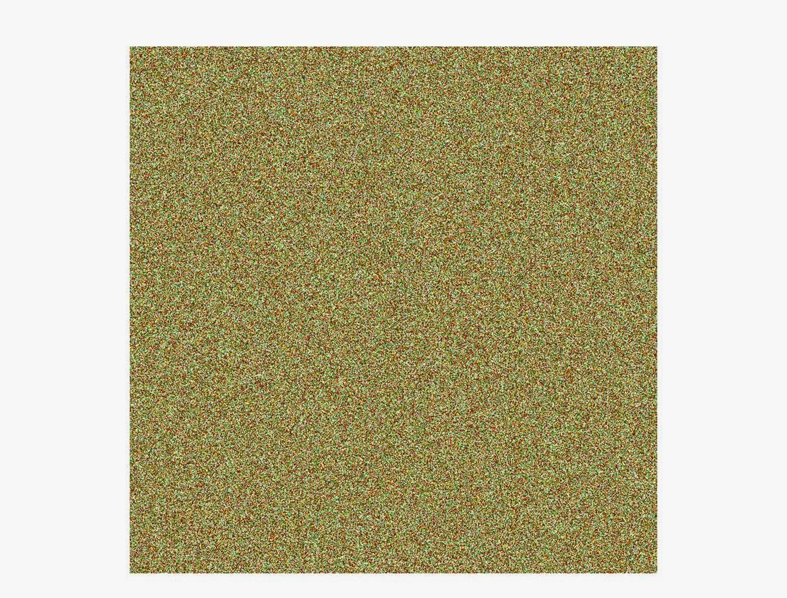
First, a series of hypothetical illustrations of resolution, with a real world example of a dataset at that resolution. The extent of the multi-colored images below is the same, the only thing changing is the resolution of the cells:
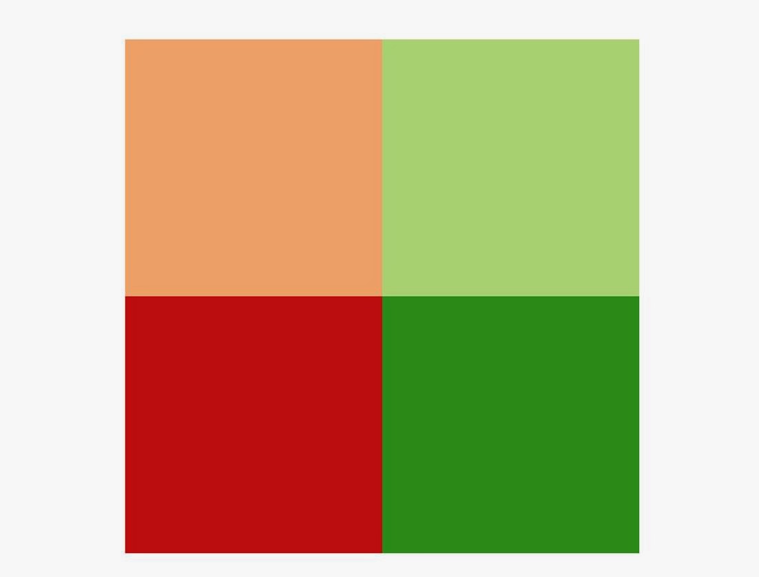 |
1000m (1 km)
4 cells
Forecasted changes to the distribution of birds in the Pacific Northwest, Global digital elevation models |
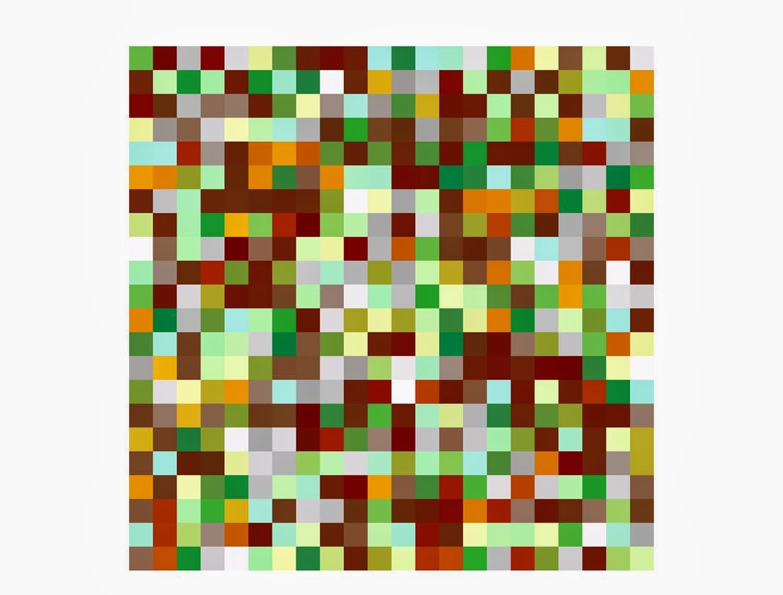 |
90m
484 cells
Bathymetric data, SRTM, older satellite imagery |
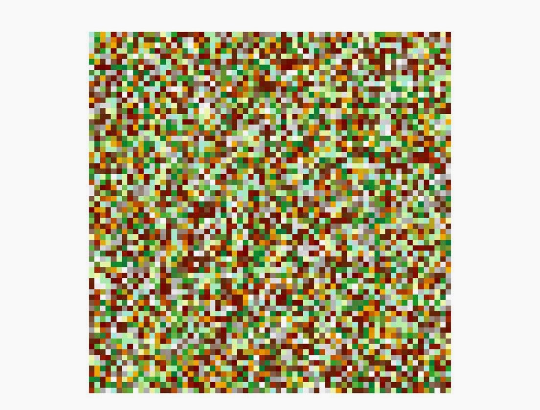 |
30m
4,356 cells
Most Landsat, some topographic data, much national scale landcover/vegetation |
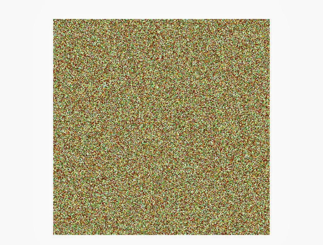 |
5m
160,000 cells
Regional Conservation Strategy data, some satellite imagery |
 |
1m
4,000,000 cells
NAIP imagery (same used for the Lark), LiDAR topographic data |
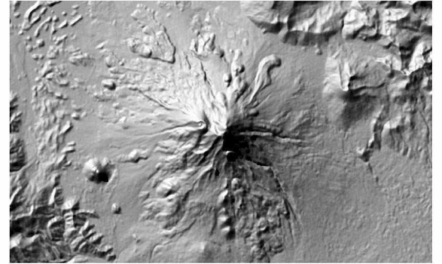
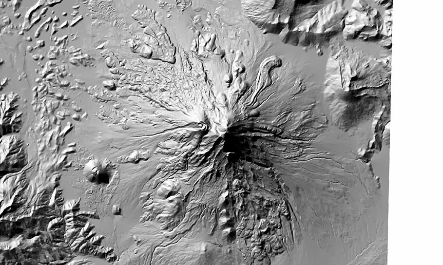
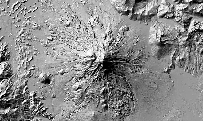
And now for a real-world illustration of resolution using digital elevation models for the area around Mt. Shasta in Northern California. Click images to embiggen:
 |
1000m
The volcano is barely recognizable, unless you step way back from your monitor and blur your vision a bit |
 |
90m
Much better! Definitely looks like a volcano now. But still not too much detail. |
 |
30m
Now we're starting to see some real detail. Individual ridges and valleys are clearly discernible. |
 |
10m
Surprisingly, the 10m data doesn't look that much better, at least at this scale. So... |
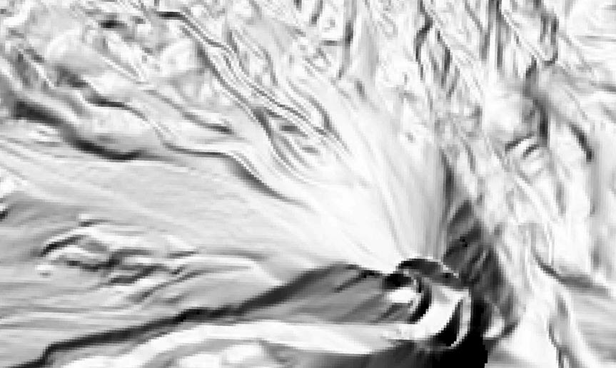 |
30m
If we zoom in to the caldera, we can see some details in the 30m data, but they aren't very crisp. |
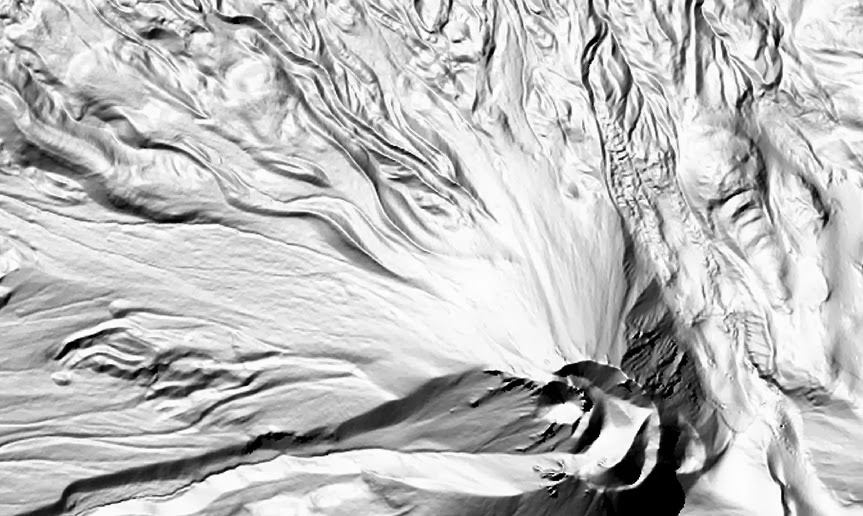 |
10m
This image shows the same area, but with the 10m data--it shows much, much more detail. |
The bottom line is that more resolution isn't always better. The scale at which the data will be displayed or analyzed should always dictate the resolution of your raster data.


