Friday, March 31, 2017

GIS Training in Nairobi Kenya

The GIS training workshop crew
For my third trip to Africa for the McKnight Foundation, I accompanied my friend and colleague Karsten Vennemann. Karsten was funded by the McKnight Foundation to provide GIS support to the Collaborative Crop Research Project (CCRP) for three years, and he hired me to assist.

The workshop was held at the African Institute for Capacity Development (AICAD) on the campus of the Jomo Kenyatta University of Agriculture and Technology. The institute covers all the bases--meeting rooms, lodging, and food. 
At the entrance gates to JKUAT
As with  my previous visits, we used open source GIS software exclusively, primarily QGIS. Unlike previous visits, this workshop was a full week and focused only on GIS--it was not tacked on to a previously scheduled research methods workshop.

The attendees came from a variety of government agencies, NGOs, and Universities. We had several students in the workshop as well, and they seemed to show the keenest interest and definitely learned the fastest!
Working on QGIS and R
Karsten and I divided the teaching duties roughly equally, and tried to give the students a balance of instruction and hands-on exercises. Unfortunately Karsten got really sick the night before our day long session on R (the open source statistical analysis package). I did my best to improvise a session using other materials, but it was difficult without Karsten! Fortunately he recovered by Friday and was able to cover some of the R material in the morning.

After teaching all day, I would make a bee line for my room, change out of my formal teaching clothes and into shorts and a t-shirt, grab my camera and binoculars, and head for the fields. JKUAT is located outside of Nairobi, and has extensive agricultural fields and the associated ponds, hedgerows, etc, all of which make excellent bird habitat.

On these daily 'bird walks' I would always see a variety of birds, but I would also meet students and locals who were just cutting through the fields. They all thought I was a bit crazy, but they were very friendly and several groups of people asked me to take their picture. I'm not entirely sure why, but I was happy to oblige.

White-winged widowbird
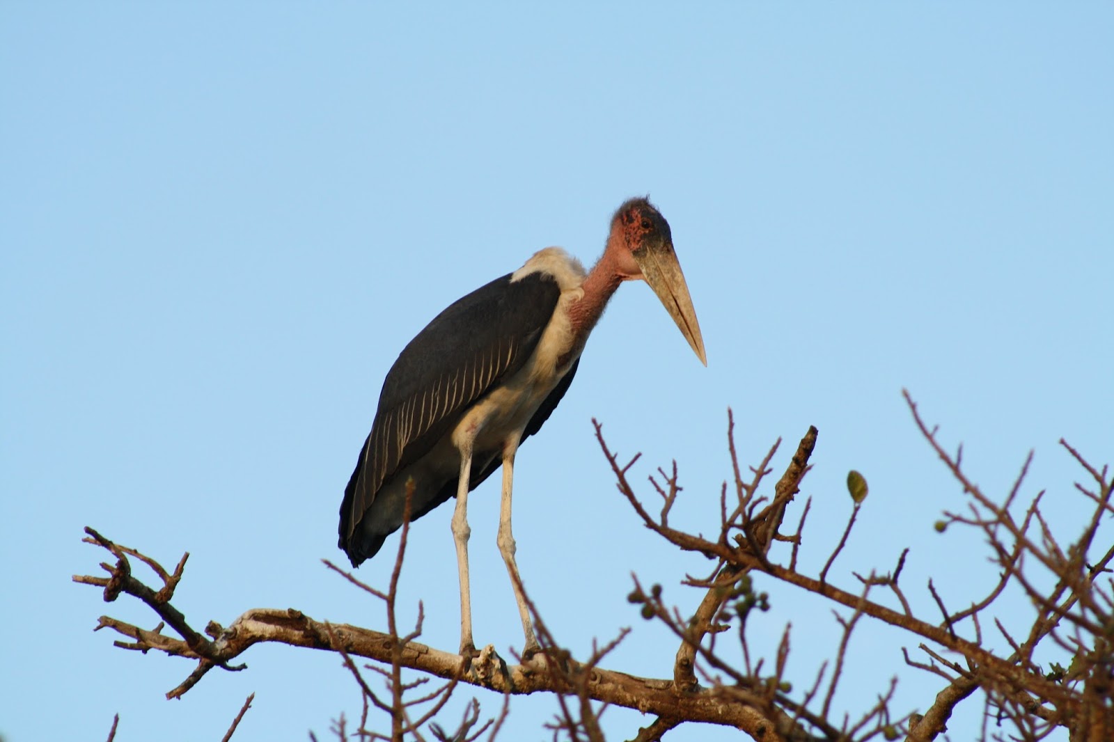
Marabou stork
Some of the friendly locals I met on one of my bird walks, they even gave me a mango!
Long-tailed mouse bird

After the workshop Karsten and I headed south from Nairobi to Amboseli National Park for a quick safari before heading back to Seattle. This was my third time to Africa for the McKnight project, and on the previous two trips there was little to no time to see the amazing wildlife and landscapes just outside of the cities hosting the workshops. Since Nairobi is surrounded by incredible national parks and reserves, Karsten and I were determined to at least take a couple of days to visit one of the nearby parks. After doing a bit of research, we were able to find a guide who would pick us up at JKUAT, drive us to Amboseli National Park, and act as our safari guide within the park as well.

We had a very early departure on the first morning and an uneventful (but long) drive south, nearly to the border with Tanzania. We had a good view of the brand new Chinese-built and Chinese-funded railroad  connecting Nairobi and Mobassa. We stayed in a (very posh) tent at the Kibo Safari Camp, just outside the entrance to Amboseli National Park.


The scenery and wildlife within and around Amboseli is truly stunning. I've never seen anything like it, and it is hard to describe the feeling of being surrounded by wild elephants, giraffes, hippos, hyenas, lions, antelope, and more bird species than I could possibly identify. So I'll let the pictures tell the story.

Our tent at Kibo

Me and Karsten on top of Observation Hill with Amboseli NP in the background
Thomson's gazelles

Hippos!

Zebra

Ostrich

Black-bellied bustard

Bull elephant

Crested cranes, symbol of Uganda

Hyena

Saddle-billed stork, straight out of a Richard Scarry book

Giraffe!

African fish-eagle, the bird I most wanted to see in Kenya!
Elephants in front of Mt. Kilimanjaro. This is one my favorite photos I took on our safari. Still can't believe I was really there!

Friday, October 28, 2016

CORE GIS 10 Year Anniversary Celebration!

CORE GIS is ten years old! On Thursday, October 27 we held a joint celebration of this milestone with our friend and colleague Karsten Vennemann of Terra GIS. We both started our consultancies back in 2006 and have collaborated on and off over the years on a wide variety of projects.

We were joined by clients, family, friends, and our fellow GIS professionals at the Bergschrund in Ballard, the tasting room for the Northwest Peaks Brewery.  It was the perfect size, the beer was tasty, and it provided the perfect setting for reflecting on ten years of mapping, analysis, and collaboration.

Here's to the next ten years!

Some of the old CommEn Space crew--Christopher, Gene, Karsten, and Matt

The extended CommEn Space family--Gene, Christopher, Karsten, Matt, and Matt


Here is a gallery of some of the maps we've created and people we've worked with over the last ten years. Enjoy!
Ten Years of Mapping at CORE GIS

Monday, August 29, 2016

Mapping and GIS Support in Tanzania

The week before last I traveled to Dar es Salaam, Tanzania to provide mapping and spatial analysis support to agricultural researchers at a Research Methods workshop organized by the McKnight Foundation Collaborative Crop Research Project (this is the same project that sent me to Ouagadougou last year). I collaborated with researchers from Tanzania, Malawi, and Mozambique, and was part of a team of support staff from the UK, Germany and Tanzania that included statisticians, plant breeders, and entomologists. The week was intense but highly productive, and I will continue working with these researchers and their projects over the next year as they strive to increase crop yields and improve soil health. Plus the workshop was held at a beach resort which was very conducive to brainstorming sessions!

The participants were organized into three groups, based upon their projects' interests:  breeding, soil fertility management, and pests/disease. The groups were led by Eva Weltzien, Ric Coe, and Tim Chancellor, respectively. The groups met in the morning, and the afternoons were reserved for one-on-one half-hour consultations with the resource people (including me). I spent my mornings working on requests from the previous afternoons' consultations, a system which I think worked pretty well.

Once again we used open source software, primarily QGIS for GIS, R for statistics, and ODK for mobile data collection.

Group shot on the last day. I was originally standing in the back next to Ric and Sam but the group said I was too short so they insisted I move to the front!
Some of the support staff I worked with during the week, from L-R: Tim Chancellor, an entomologist/plant pathologist from University of Greenwich; Sam Dumble, a statistician from University of Reading, Eva Weltzien, a plant breeder from the International Crop Research Institute, and Prudence Kaijage, the man who organized the whole workshop and ran all the logistics.
A new piece of data and analysis we were able to offer to participants at this Workshop is Standard Precipitation Index data which we derived from CHIRPS data, produced by the Climate Hazards Group at UCSB. The CHIRPS dataset is quite remarkable, and although it is not perfect, is extremely useful to the researchers because of its utility in both interpreting their research results and understanding long term trends in precipitation. CHIRPS is a 30+ year quasi-global rainfall dataset that blends data from ground-based observation stations and satellite data. The data has a global spatial resolution of 0.05 x 0.05, and daily data are available for Africa at a resolution of 0.25 x 0.25 degrees. Data can be downloaded in daily, pentad, dekad, monthly, 2-monthly, 3-monthly, and annual time steps.

I used it both for the Cowpea Systems project in Mozambique and for the Best Bets project in Malawi. The Cowpea Systems researchers wanted to see patterns of precipitation relative to their study areas for the two dekads that bracket the end of March/beginning of April. The SPI clearly shows the very dry conditions in the southern part of the country, where many farms failed. The Best Bets project requested both monthly average precipitation and monthly SPI for all months in last year's growing season.

In both cases, the SPI maps express precipitation over a given period in terms of standard deviations from the 35 year average for the same time period.

Average precipitation, standard deviation of precipitation, and SPI for Mozambique for the 3rd dekad of March and 1st dekad of April
Average precipitation and SPI for Malawi for last growing season, with research sites indicated in red dots and study areas represented by grey outlines
Eva Weltzien leads the plant breeding group while Sam preps for his next consultation
Ric Coe running a session with his soil fertility group
Tim Chancellor facillitating the pests/disease session

My dance card filled up quickly!
Working with Josephine and Emmanual, Pigeon Pea researchers from Tanzania
I made several maps with Emmanual and Josephine, this one shows their research sites and elevation
This map shows the Pigeon Pea research sites and soil organic carbon within soil 5-15 cm below the surface
I walked for about an hour every morning at sunrise. This is a Dhow, a traditional lateen-rigged sailing vessel.
A flock of speckled mouse birds
We ate all of our meals under the palapa
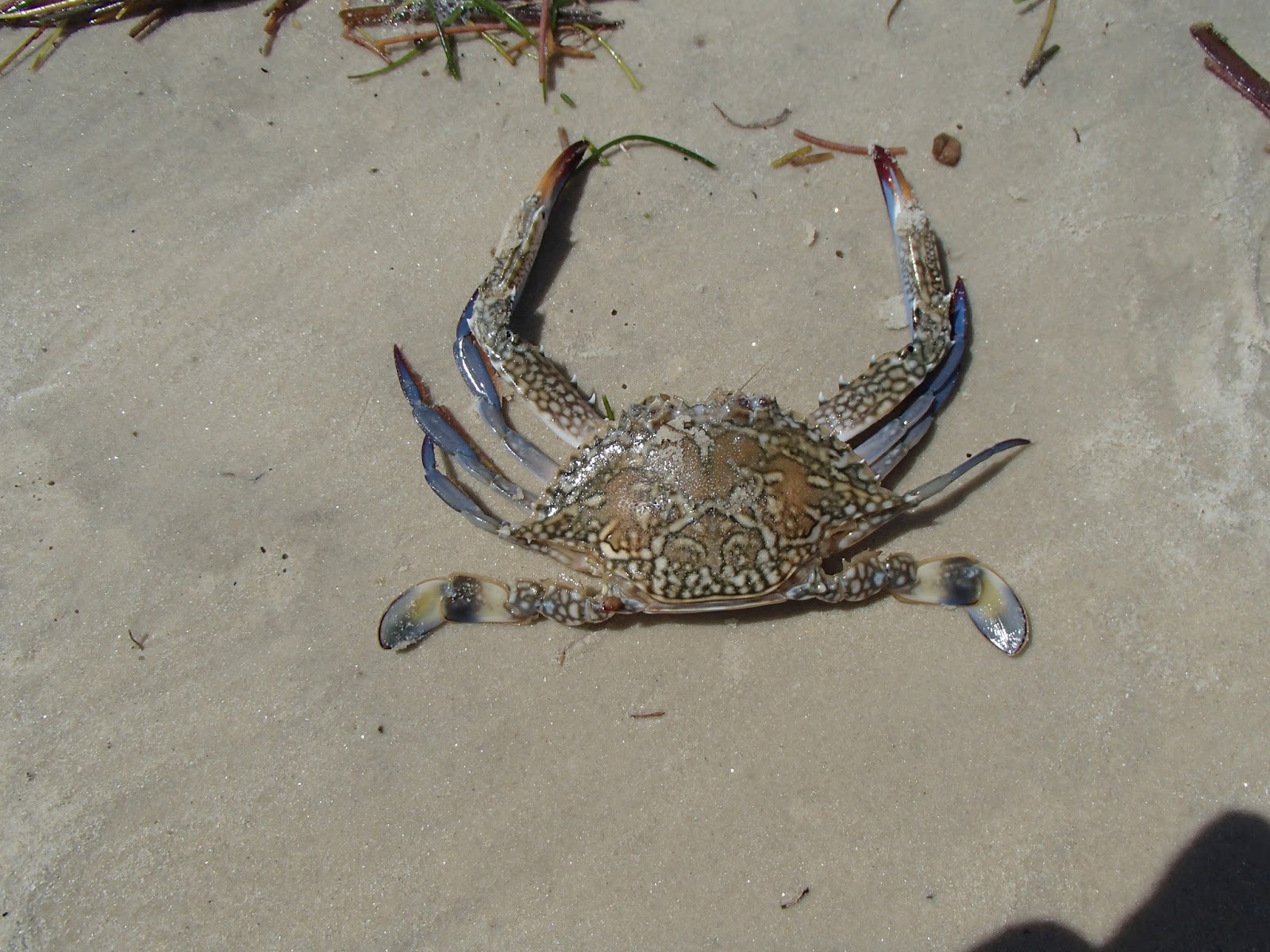
One of the crabs I saw on my beach walk

An interesting sea star

Our view during tea breaks, from the fourth floor veranda

Although I did not get to see much of Dar es Salaam or the surrounding countryside during my time in Tanzania, I was able to stop at the Mwenge Craft Market on the way to the airport. I purchased a couple of carvings from this woman, named Heaven

Tuesday, June 14, 2016

Reducing Shadows in Landcover Classifications Derived from Near-IR NAIP

Over the last few years I have produced several high-resolution land cover classifications using the excellent 1-meter resolution 4-band NAIP orthophotography available from the USDA APFO.

For the most recent classification I used the 2015 4-band NAIP to produce a landcover classification of the Hylebos Watershed for EarthCorps, who have been actively restoring riparian areas and wetlands in the watershed. They are planning to use the landcover for a  variety of analytical and prioritization purposes. Unfortunately, the sun angle at the time of image acquisition produced a lot of shadowed areas, which reduces the usefulness of the landcover data.

Original 2015 NAIP

Preliminary landcover classification--note large areas of shadow within forested classes

In order to fix this, I tried a new approach:  extract the shadow class, mask each of the bands to the shadows, and run an unsupervised classification using isocluster (the original landcover classification was produced using supervised classification on six bands, to learn more please see this excellent slide deck produced by Chris Behee). Here is the extracted shadow class, followed by the masked NDVI:

The extracted shadow class

NDVI within shadows (greener = higher photosynthetic activity, redder = lower photosynthetic activity)
The isocluster output generated a new set of 10 classes, three of which represented forested classes.

Output from isocluster on the masked bands
 My hope was the remaining 7 classes could be used to differentiate dry grass and impervious surfaces, but the extremely dry conditions during the 2015 summer resulted in very low photosynthetic activity and consequently the remaining 7 classes were highly confused, so they remained as shadows.

The resultant forested classes within shadows were added back into the classification to produce the final product:

Greatly reduced shadows in the landcover classification

Which is a big improvement! Here is a view of the landcover classification within the entire watershed.


Wednesday, May 25, 2016

Mapping Historic Ballard

Yesterday I attended the 2016 Washington URISA conference in Tacoma and gave a presentation called Mapping Historic Ballard with Crowd Sourced Mobile Data Collection to a room full of my GIS colleagues. The slides from my talk are available here and should also be available on the conference site sometime soon. I had a great time at the conference, and as usual came away with new friends, ideas and insights.

The Mapping Historic Ballard project is nearly complete and we will be celebrating the completion of the project on Saturday, June 4 at the Sunset Hill Community Center (more details here).

Here are some preliminary versions of our results maps, taken from the presentation:

The buildings shown on this map are the best of the best--the Select 150 and Vintage 500. These buildings are high-integrity historic structures that provide broad representation of the neighborhood spatially, temporally, and architecturally
In addition to the representative sub-set, we are able to create a variety of maps using the attributes collected during the survey. This map shows buildings by type.

This map shows all parcels by evaluation category.

In addition to the static maps, stats, and spatial data we produced for the project, we also generated a series of interactive webmaps. Below is the map of the full survey--click a parcel to see a photo of the building, as well as a list of structural and site characteristics. (a full screen version is available here).


We built a series of 'time travel' maps that enable users to swipe back and forth between the past and the present day. Here is a screenshot of the map showing 1904/2015, click here for the interactive version:


 1937/2015, click here for interactive version:


1996/2015, click here for interactive version:


My talk focused heavily on the volunteer-driven nature of the project, and I want to acknowledge the tremendous dedication and effort exhibited by the dozens of Ballardites who walked the neighborhood and used their mobile devices to gather the survey data. Here are a few pictures from the first training session and the field survey.

The first batch of volunteers at the training session held at Ballard Library


Kris Royer Collins and Brid Nowlan, gathering data on a chilly February day


Benson Shaw, collecting data and smiling as usual

Friday, February 19, 2016

Eruption: The Untold Story of Mount St. Helens

Last year I had the pleasure of working with local author Steve Olson on his new book Eruption:  The Untold Story of Mount St. Helens, to be published next month by W.W. Norton. I made several maps for the book, and the best thing about working with Steve (from a cartographer's perspective!) is his love of maps and willingness to take a somewhat unorthodox approach to integrating maps into his book. We were able to develop several 3D views that I think worked really well (examples below).

Steve will be talking about the book with Steve Scher at Town Hall on Monday, March 7, and you can get tickets for that event here. For those of you in Portland, he will be speaking at Powell's Books on Wednesday March 9 at 7:30. More info here.

You can pre-order a copy of the book here, here, and of course here.

Here is my advance copy of the book:


Here is one of the maps, as it appears in the book:


Here are digital versions of a couple maps: