Thursday, December 22, 2011

Six Seasons of CORE GIS Holiday Cards

Each holiday season for the past six winters we've produced a custom card to send to colleagues and clients. I thought it might be fun to post each of the designs, especially for more recent acquaintances who may not have seen the earlier editions.

Happy Holidays, everyone!

2006:  Happy Watersheds
2007:  Christmas Island

2008:  Holiday Topo Map

2009:  Map Sledding
2010:  Global Seaturtle
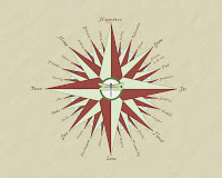
2011:  Holiday Compass Rose

Thursday, December 15, 2011

Teaching Geography to 2nd Graders


My son is in second grade, and his teacher was absent for a couple of days this week so I volunteered to teach the geography lesson. I spent about 45 minutes teaching the kids about geographic projections. It was so much fun! The kids were all enthusiastic, attentive, observant, and lots of fun.

We started with a discussion about the shape of the Earth, using a globe as an example, and talked about why it's usually more convenient to have a flat map on paper or on a screen when you need to do something map related. Then we talked about how the transition is made from three dimensions to two, and I passed out a satsuma to every student. I asked them to pretend their orange was the Earth and asked them to transform the orange peel into a flat, rectangular surface. Before they began, I explained that there is no wrong or right solution, and that the task is in fact impossible--but it would be really interesting and fun to try to solve it. They worked cooperatively to complete their 'projections.' After all the kids were finished, they ate the oranges, then took turns table by table looking at the solutions generated by their classmates. I asked them to make observations:  what did the solutions have in common? how were they different? what conclusions could they draw? Then we gathered on the floor and they shared their observations.

This is the part that really blew me away--of course, they all quickly ascertained that it was a very tricky problem, but they also understood that for small areas, it was possible to minimize the distortion of the peel, and that certain patterns seemed easier to work with than others. Many of the kids kept their peels in one piece, some intentionally split them into numerous pieces and re-assembled it, and some did a bit of both. During the discussion, every student made an observation or asked a question, and many did both.

After the discussion I drew a picture illustrating the mechanics of translating the a sphere to a flat surface, then showed them a poster I prepared showing nine different global projections, ranging from Mercator to Sinusoidal to Goode-Homolosine. We didn't spend a ton of time on any particular projection, but we did discuss the various applications for some of them (i.e., Mercator is great for navigation but not so good for wall maps) and they all saw that the projections are just as varied as their orange-peel solutions.

At the very end I passed out a make-your-own-globe paper that I found here. I demonstrated to the class how to make the globe, using these directions:

1. Cut around the 12 segments (gores) that make up the globe. Cut right in between the gores so your scissors almost touch the equator (the line running through the middle) but don't cut all the way through!
2. Roll the cut-out into a cylinder and tape together both ends of the equator where they meet.
3. Take four pieces of tape, cross two, cross the other two, then cross the two sets (so you've created an asterisk of tape) and place it on the pointed end of one of the gores, so the sticky side faces upwards.
4. Bend the other 11 gores into the middle, so the tips meet at the same point.
5. Stick them down firmly on the tape. This end should now be cupped.
6. Do the same with the gores at the other end to create a sphere.


Don't be disappointed if your globe is not a perfect sphere. It is actually impossible to recreate a perfect sphere from a simple template like this! In fact, at the beginning of the lesson, I told the kids we were going to attempt two impossible things. The orange peel projection was the first, and creating a 3D sphere from a 2D sheet of paper is the second!

Have fun making your globes. :)

Tuesday, July 12, 2011

ESRI UC Day 2--not an auspicious start

Not an auspicious start to the second day at all. My suspicions about the weak showing of the conservation GIS community was confirmed at the first session I had planned on attending:


And at the second:


Hopefully the rest of the day will be better...?

ESRI UC Day 1

The first day of the UC was informative, fun, and at times a little overwhelming. Jack and his colleagues were doing their thing at the plenary, and made a few announcements about 10.1 and ArcGIS Online that I found particularly noteworthy:

  • Dynamic legneds will be supported (finally!!)
  • Automatic image enhancement
  • Dynamic viewing of LAS files (LiDAR)
  • Right-click within an MXD to package and/or convert map into a service
  • ArcGIS online now supports a wide range of data import options, including drag-and-drop of CSV for point data (that was one of the coolest demos of the plenary)
  • ESRI is in the process of building a global, multi-resolution topographic mosaic that will also include user-contributed hi-res LiDAR. Not clear about when that will launch, but the data will be accessible as WMS *and* as points and rasters.

BEST NEWS OF ALL: ESRI is releasing 'ArcGIS Home' desktop + extensions for $100. The idea is to enable neophytes to get started, veterans to develop new skills, and anyone to use their software for volunteer projects.

Unfortunately, I felt like the message from ESRI at the plenary was WEB WEB WEB WEB and there was very little emphasis on any of the cool new analytical tools they are developing in the desktop, much less on how they're dealing with the huge list of bugs at 10.0 (for example, I still can't get dissolve to work, which is why I'm still about 90% in 9.3.1). I understand where they're coming from, but it would sure be great if they'd get the core functionality of their software working before they push us all into the bright shiny cloud-computing future.

Jack doing his thing at the plenary


After the morning plenary we had a two hour break, and after a great lunch with my former colleague (and current Cascade Land Conservancy GIS Manage)r Christopher Walter, I took in some of the sights of the waterfront, including the San Diego Maritime Museum. It was really great to finally explore the Surprise, a ship I've read so much about in Patrick O'Brian's novels.

The HMS Surprise!
The map gallery reception that afternoon was superb as usual, but it sure seems like there is far, far less representation of the non-profit world in general and the conservation GIS community in particular.

One of the many cool maps on display in the Map Gallery. How the heck did they create that symbology?!

Monday, July 11, 2011

At the 2011 ESRI International User Conference

I'm here in sunny San Diego attending the 2011 ESRI International User Conference. After arriving and registering, I posted four CORE GIS maps in the Map Gallery: Lopez Island Potential Trail Corridors (created for San Juan County and the Trust for Public Land), California Coast Reslient Habitats, Greater Everglades Resilient Habitats, and Pacific Northwest Resilient Habitats (all created for the Sierra Club's Resilient Habitats Campaign).

I'm presenting on Thursday morning at 10:15 in Room 30E on the work CORE GIS did for San Juan County. My co-presenter is Breece Roberts of the Trust for Public Land. If you're here at the conference, please stop by and check it out.

I'll be posting throughout the conference and will include many more photos. I'll also post the occasional tweet, you can follow me at http://twitter.com/COREGIS.


CORE GIS posters all mounted in the Map Gallery


My ride during the conference

Tuesday, March 22, 2011

Friday Harbor Data Development Video

I just got the link to the PPI Group Friday Harbor video I mentioned in the last post (thanks to Greg Sutherland at San Juan County) and you can watch it here.

NW WA GIS User Group Presentation

The NWWAGIS User Group meeting in Bellingham on Friday was really great. There were lots of interesting people to meet and talk with (including a client I had not yet met in person!), some excellent presentations, and lots of good discussion.

An impromptu presentation by Greg Sutherland of San Juan County was particularly noteworthy--he showed a YouTube clip of a demo the PPI Group did for San Juan County Public Works. They showed up on the 10:00 am boat, drove their special data collection vehicle around Friday Harbor for a couple of hours, and prepared a demo by 1:00. They collected multi-angle high-resolution photos (similar to the Google StreetView photos) and a very dense LiDAR point cloud. The end result? Engineers are able to take measurements of rights-of-way, cross walks, stop signs, utility poles, you name it, all from a street-level photo. I think the video might be 'invite only' since PPI is courting San Juan county as a client, but once I find the link I'll post here.


My talk seemed to go fairly well, and I received some positive feedback afterwards and lots of helpful suggestions about some of the trickier analytical questions. Here is a PDF if you would like to check it out. Many thanks to Dan Siemann and all of the folks at the National Wildlife Federation for asking me to work on this interesting project, and the Mountaineers Foundation for providing some of the funding.

Thursday, March 17, 2011

CORE GIS--Live!

I will be giving a presentation tomorrow in Bellingham to the Northwest Washington GIS User's Group.

March 18th, 2011
9:00-12:00 am
City of Bellingham, Fireplace Room
625 Halleck St, Bellingham

Click here for a PDF map.

I'll be talking about some recently completed work I did for the National Wildlife Federation examining floodplains, flooding, and wildlife. I'll post the presentation here and on the website next week.

Thursday, February 24, 2011

Great Data, Byzantine Retrieval System

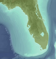
I am working on a series of maps for the Sierra Club's Resilient Habitat's campaign. The maps have been great fun and cover geography that I haven't mapped in awhile. The most recent map covers the Greater Everglades ecosystem, and since the habitat extent includes a substantial portion of the Atlantic ocean and Gulf of Mexico, we thought it might add visual interest to show bathymetry.

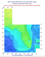
After doing a bit of research, I found a great source for integrated terrain and bathymetry at the NOAA coastal relief site. I found my area of interest, clicked on the link to download the data, and was somewhat surprised to see no obvious way to download the data--no 'download' button, no FTP link, nothing. I did notice a 'Create Custom Grid', but since I wanted all of the data shown in the map, that seemed like a hassle. So I called NOAA, and to my utter astonishment, reached an extremely helpful human being on my first attempt. She didn't know how to obtain the data either, but transferred me to someone who did.


Turns out, the ONLY way to obtain the data is by the 'Create Custom Grid' button, even if you want the whole enchilada. But it gets better--you can't specify the whole extent in the create custom grid dialogue, because the extractor limits your request to about 8,000 cells in either direction. So, I had to split the grid into fourths. Here are my notes outlining how to do that:


The grids are extracted and exported as ASCII text files, which I imported to ArcGIS GRIDs. But there's another catch: the upper value of each grid showed up as 65,535. This did not seem like a plausible elevation value (unless the Z values were in centimeters?!) so after a bit of Googling found this helpful post by Thomas Ballatore on the ESRI Support website. This is in response to someone working with SRTM data, but the same procedure worked equally well on the NOAA coastal relief data:

The SRTM files contain values from 0 to 65535. In a given SRTM tile, most of the values will be "typical" elevation values like the 1,133m and below you mention. However, areas where there is no data (voids) are assigned a value of 32768. The setnull command mentioned above would indeed set those values to "nodata".

HOWEVER, the SRTM data also correctly contains areas below sea level. These are reported as decreasing values from 65536. For example, an elevation of -2m would have a value of 65534, and elevation of -10 would be 65526 and so on.

For every country I have worked with that has a coastline, there will be a number of these along the coastline. Whether they are truly below sea level or if that is just an inaccuracy of the SRTM data would require further investigation.

Anyway, if you set all values greater than 1133 to nodata, then you will incorrectly set these negative values also to nodata. To avoid that, I use the following two steps in Raster Calculator to correctly prepare the SRTM data:

Step 1. Execute the following:

setnull([N30E119.bil] == 32768,[N30E119.bil])

where N30E119.bil is an SRTM file I was recently working with...change this to your tile's name. This will set the voids to nodata.

Step 2. Then execute this:

con([N30E119.bil] > 32768,[N30E119.bil] - 65536,[N30E119.bil])

This will correctly convert the negative values to negative values. Remember that spaces are important in raster calculator!
After running this on each of my four grids, I mosaiced them into a single grid, derived some hillshade, and was good to go.


Once the Florida Resilient Habitats map is finalized and Sierra Club has signed off on it, I will post it here.

Saturday, February 5, 2011

The Ephemeral Nature of Maps in our Modern Age

I've been thinking a lot about history these past several weeks, primarily because of the historic mapping work I described in an earlier post, but also because I am reading The Pirate Hunter by Richard Zacks. This excellent book is the true-life account of Captain Kidd, and it is based on painstaking research Zacks undertook for nearly three years, poring over historical documents, letters, diaries, newspapers, etc. Yes, it was time consuming and occasionally difficult work, but it was possible for Zacks to do the research because once he located a document, he could actually read it--or have it translated--and did not need to rely on any technology other than his eyes and grasp of archaic phraseology.


Captain William Kidd's 315 year old commission from the King of England


Similarly, but on a much more localized scale, I have been working with a client to recreate the land ownership pattern of portions of southwest Washington based on a digital scan of a hard copy map that was produced in 1891. This 120 year old map was created by hand with pen and ink, but it is remarkably accurate given the limitations of surveying and cartographic technologies available at the time. But similarly to Zacks, all we need to do is use our eyes to interpret the map and determine what was happening on the landscape back in the 19th century.

Let's contrast that with the current situation. Most of the maps we create are transmitted as PDFs, JPGs, or some other electronic format, and rarely printed out (maybe 5-10% are printed out). When they are printed, most of the non-profit organizations and government agencies do not have any clear system for cataloging and archiving the maps (or data used to create them) for posterity. Compounding the problem, more and more maps are completely web-based: the base layers might come from a variety of sources--Google, USGS, NOAA, NRCS, you name it--and the 'value-added' content might be coming from any number of other servers. The various layers are widely distributed across dozens of servers, and the underlying information is updated at varying intervals. How do you even capture a "snapshot" of an interactive map like that? What are the chances that the full functionality of any web map can be reproduced 120 years from now? I think very slim indeed, but perhaps I am being overly pessimistic.

The great irony seems to be that we now have access to more information than any other generation in history, but future historians will be able to access only a tiny fraction of it, because we are not doing a sufficient job of preserving it.

Obviously I am not the first person to surf this particular brainwave--for example, see here, here, here, here, and especially here.

Monday, January 31, 2011

Promoting Geographic Literacy


I volunteer on the board of my son's Parent-Teacher-Student Association board. My role is to maintain and update the PTSA's website, but at a recent meeting one of the board members mentioned needing to find grant money to provide world maps to several classrooms in the school. My first thought was "How could it be possible that any classroom in any school lacks something as fundamental to a decent education as a world map?!?" My second thought was "Hey, I have a color plotter, and know a bit about maps..." and before I realized what I was saying had volunteered to provide all of the maps as a donation to the school.

I love designing maps and it would have been fun to create a world map from scratch; unfortunately, I did not have time for such a monumental undertaking, so decided to search for a decent, public domain map. I found one here at the World Factbook.

So far I have provided eight poster-sized versions of the map, and they seem to be a hit with the teachers and the students.


A couple of future world travelers in front of the printed map.

Tuesday, January 25, 2011

More Historic Mapping--Mt. St. Helens

For over a year I have been working on a series of maps featuring Mt. St. Helens (MSH) and the surrounding region for both the Sierra Club and the National Parks Conservation Association. Both groups have been advocating some major changes to the management status of the current National Volcanic Monument (NVM), and the mapping has been used to support their lobbying efforts.

An interesting spin-off of this work is the recreation of historic land ownership patterns. In order to fully understand the current land ownership and management situation in and around MSH, it's important to have an understanding of the previous policy decisions that got us here. I have been working with Charlie Raines to develop a variety of data from historic maps (100 to 130 years before the present day) and it is really fascinating.

On a personal level, it is humbling to work with these maps that were created by hand--with pen, ink and paper--before there were aerial photographs, orthophotos, satellites, even NAD 27! These old maps georeference remarkably well with the modern-day USPLS townships and sections.

However, there have been some major changes to this landscape over the past 100 years, both natural and man-made. Mt St Helens lost over 1,300 feet of elevation as a result of the 1980 eruption, and we humans built roads, railroads, and numerous large reservoirs on the Lewis, Cowlitz, Nisqually, Bumping, and Columbia river systems. As part of the historic mapping process, I've had a lot of fun 'reversing' these changes by deleting the reservoirs, re-drawing the rivers in their original channels, and erasing highways and interstates.

These maps are still a work in progress so I cannot share them just yet, but here are a couple of screen shots to give you a feel of the historic/modern juxtaposition.


A "split-screen" view, showing an 1891 Northern Pacific Railroad land grant map on the left, and the modern CORE GIS map on the right. Note the fold in the historic map running right-to-left between the 'river' label on the left and Swift Reservoir on the right. Click on thumbnail to embiggen.


Another view of the Northern Pacific Railroad land grant map, this one focused on the region around Mossyrock.


Modern-day view of the same extent.